Fonts are like buildings. Most fonts pass us by completely overlooked, and we notice only the most elegant, or the most grotesque. When your target audience views your message in a font which they really can’t stand, all attention can be drawn away from the message and toward the messenger.
Slovakian graphic and typeface designer Peter Biľak recently wrote a blog post elucidating what beauty and ugliness in typography really means. His “thesis” was that exquisiteness and repulsiveness in fonts are really two sides of the same coin, and clarified that thickness and thinness of lines have a huge part to play in the perception of fonts as either tasteful and dignified or strange and monstrous. The key word in the last sentence was of course “perception”, because, as “The Private World of Darkness”, an episode of Rod Sterling’s timeless show The Twilight Zone, pointed out, beauty is well and truly in the eye of the beholder.

Biľak named Pica Italian as an example of an “ugly” font…

…and Bodoni as a “beautiful” one.
You may notice that Pica is almost the exact inverse of Bodoni in that thick lines in Pica are think in Bodoni and vice versa. Biľak even invented a font called Karloff which exists in a continuum of line thicknesses to illustrate his point, and to show that an intermediate form, one in which all lines are of the same thickness is neutral to look at.
![beauty-and-ugliness-in-type-font-design[1]](https://aperimentis.files.wordpress.com/2013/12/beauty-and-ugliness-in-type-font-design1.png)
Is it really that simple though?
I also believe that overuse and misuse (as well as perceived attractiveness) also tend to have an impact on the way fonts are generally viewed. No matter how “neutral” a particular typeface may be objectively, misuse can cause it to be reviled and vituperated. Typefaces have personalities and if their personalities don’t match the essence of your message, you can create a conflict which distracts your audience.
Here I have provided a countdown of the 10 worst fonts that I love to hate, and the proposed reasons why I do, followed by 5 fonts which I believe have stood the test of time.
10. Times New Roman

The times newspaper has been published since 1785 and has gone through a number of changed in appearance from the introduction of headlines in the late 19th century, to the printing of images in colour in the 1970s.
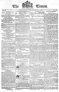
The Times in 1788 without headlines or images.
The Times started using the Monotype Modern typeface in 1908 but in 1931, Stanley Morison write an article critiquing the “badly printed and typographically antiquated” newspaper. A few months later, the newspaper commissioned Victor Lardent, a typographer at the English branch of Monotype to design a new font for the newspaper. Lardent and Morison used an older font named Plantin as the basis for Times New Roman, but revised it to improve legibility and economy of space.
Since then, The Times has undergone several font changes. Times Europa was introduced in 1972 as a sturdier alternative with more open counter spaces. Times Roman replaced Times Europa in 1982 followed by Times Millennium in 1991, Times Classic in 2001 which was designed to take advantage of the new computer-based publishing system, and Times Modern in 2006, designed for improving legibility in smaller font sizes on both the computer and in print.
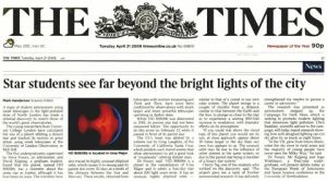
Until very recently, this was the most common font that you could come across in print or online. It has since been superceded by Arial as sans-serif fonts gain in popularity against serif ones, but you do still see it a lot. Admittedly, the reason this font has stood the test of time is because of its neutrality and its versatility and it is used by a mottley crew including HSBC, Bacardi and Time magazine.

However, as it has become the default font for making text and logos, when it is used, it gives an air of laziness and unoriginality. TNR now is what Courier was 30 years ago: the plainest, most unimaginative font that you use when you rush out a document without considering its aesthetic appearance.
9. Neuland

Neuland used to conjure up images of the African Savannah
Designed by German typographer Rudolf Koch in 1923, the thick and bulky form of Neuland and its sister font, Neuland Inline brings forth connotations of the darkest depths of sub-saharan Africa like no other font. It is often used when an “exotic” or “primitive” look is desired, whether African, Native American or… Jurassic.
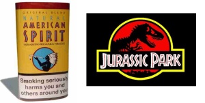
Neuland Inliine used to bring to mind the image of Native Americans or… dinosaurs
Aside from the obvious and condescending association of sub-saharan Africa (and any other culture perceived as “primitive”) with exoticness and crudity, the font is quite clunky, inelegant and impractical for normal use.
8. Brush script

Brush Script is the ultimate in deceitful fonts. The aim is to give the impression that someone has just signed their name Kellogg’s-style or jotted down something on a piece of paper. It was supposed to be a “quaint and consistent type that looked as if it was written by a fluid, carefree human”, yet, who ever writes with a brush, and whose letters are always exactly the same shape, inclination and size?
The Australian soap opera Neighbours used the font from 1985 to 2007 when they switched to a plain and skinny block sans serif typeface.

It was used as part of the logo for the Jerry Springer Show, perhaps in an attempt to make it seem as if Springer had written it in his own handwriting. Unfortunately, no-one told the producers of the show that that is not Springer’s handwriting. They weren’t fooling anyone.
7. Matisse

There are some typefaces which work well within a design. Then, there are some fonts that seem to scream “I have no real design, I just want to look different!”. Matisse is trying to join this band of merry fonts that pays no attention to aesthetics or beauty. (Algerian is another such font.)
The Matisse font brings to mind little knives, piercing my eyes over and over and over again, which is a different image that the original work upon which it is based conjures up.

The most annoying thing about this font though is that it was named in honour of one of the greatest artists in history. I can think of few other fonts so unsophisticated, so barbaric, so visually discordant, so lacking in style and so unrelated to its name. Luckily, it’s not as pervasive as other awful fonts so it ends up at number 7.
6. Curlz

Churros are curly so there is obviously only one typeface that could be used.
The only word I have to say in reaction to this font is “ewwwww”, and that’s just in reaction to its name. Curlz… *shudder*… is best suited to a 5-year-old girl’s birthday party invitations but even then, the girl should have better taste.
It is over-saccharine, over-whimsical, much too curly and, as usual, used in the most inappropriate of situations. A font which is associated with immaturity and cheap gaudiness is not suited to anything other than primary school girls’ birthday invitations, yet people don’t seem to get the picture.

What better way to showcase one of the staples of ancient Babylon than with the ever-so versatile typeface of Curlz?
Here is a blog of various inappropriate ways that Curlz has been used: http://curlz.tumblr.com/
5. Jokerman
Flamboyant, obnoxious and garish. The Jokerman font is a bit of a joke, really… pun intended. Even in the clown show advertisement below it seems a tad excessive and illegible.

I really don’t understand what it’s supposed to represent. Even Curlz is more consistent than Jokerman, which just has random dots, ridges and lines all over it for no apparent reason at all.
It is supposed to be a fancy font for decoration purposes, but it is awkward and foolish. The only good thing about it is that it is SO extreme, that it doesn’t really lend itself to excessive use, so is not as popular as some other terrible fonts are. That said, it does pop up in the most inappropriate of situations.

This website (http://steve-lovelace.com/famous-logos-in-jokerman-font/) shows how it can be extremely excessive when used to write out familliar logos. The logos lose some of their professionalism and .
4. Comic Sans

Designed by Vincent Connare in 1994, the pervasiveness of this font as well as its misuse has lead to it being one of the most reviled fonts of all time. Entire anti-Comic Sans websites have been set up with vitriolic tirades against it. T-shirts have been printed denouncing it as a curse on humanity. Graphic designer Dave Combs famously told the Huffington Post that it “looks like someone threw up on the keyboard and that’s what came out”. Combs has also launched a website calling for a permanent ban on Comic Sans and calling it a “blight on the landscape of typography”. The designer of the font Mr. Connare famously defended his font, rebuking haters like Combs stating that they should “Get a hobby“, which I agree with in part as I don’t think it is healthy for people to get so worked up about a mere font. However, the font can grate on the eyes when it is used in everything from professional emails to lost dog posters. According to byteandchew.com, ‘even the Vatican uses the font for its official photo albums’.

Typographic engineer, Vincent Connare said that he invented Comic Sans as a remedy to Times New Roman. Comic Sans was invented to solve a specific ‘problem’. Connare invented it for a cartoon dog, which was an avatar of a particular computer program he used. He states: “When I loaded the CD a little dog came up. He talked in a speech balloon like you would get in a newspaper cartoon strip, but it was in the system font Times New Roman…I thought ‘that’s silly. Dogs don’t talk like that.’ So I said it would look better if it looked like a comic book”.
Be that as it may, the omnipresence of the font and its use in inappropriate situations has lead to its appearance on this list. Some of the most egregious, tasteless and thoughtless uses of the font appear below. Click to enlarge in a new window.

Todd Klein did an analysis of why Comic Sans isn’t even appropriate for comic books in his post, “Comic Sans Font Examined“. It’s an interesting read, and points out some further shortcomings of the font.
3. Bradley Hand

Who the hell is Bradley, and why hath his hand wrought such evil? Like Brush Script, Bradley Hand is an attempt to imitate the handwriting of some imaginary person. Bradley Hand is the artificial wood veneer of typefaces, often used to try to make something look classy, but usually makes it look cheap instead. If you really must make something look as if it were handwritten why don’t you just hand write it. It is like a comb-over, used by people trying to hide the fact that they are actually using a typeface. Make up your mind. Either hand write it, or use a typeface… you can’t have it both ways.
2. Papyrus

Papyrus says Egypt in the same way as Neuland says Sub-Saharan Africa. My 11-12 year old students recently did a summer project on Egypt and 70% of them had dipped their work in tea, burned the edges and used the Papyrus font to write the word “Egypt” at the top of the page.
As with Neuland, Papyrus is often used not just for Egyptian when an “exotic”, ancient or “wise” feel is desired.

In Avatar, the Na’vi are so ancient and wise that all their words are subtitled in Papyrus.
I think one of the reasons why Papyrus is such a despised font is not that it is badly designed, but that it was designed to look reminiscent of ancient Egyptian hand-writing on papyrus, but it’s used for situations that aren’t trying to communicate ancient, Egyptian, or hand-crafted. Then again, which ancient Egyptian have you seen writing like that? The font merely reinforces the stereotypes.

1. 2012 Headline (London Olympics)

Most of my disdain for this font probably comes from the negative associations it provokes in my mind. While the now infamous Wolff Olins, a brand consultancy was paid £400,000 to design a logo to represent the UK in the 2012 Olympics, primary school children were proving that their grasp of typography and design was far superior to the eggheads who came up with this monstrosity.
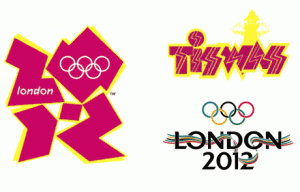
Inspired by graffiti tags, the “dynamic”, “edgy” and “vibrant” logo was supposedly aimed at the “internet generation”, although similarity to the Tiswas logo made it seem like it was targeted at the Atari generation. Even Jacques Roche, the chairman of the Olympic Committee said it was a “truly innovative brand”, even though he knew full well it was more of a blast from the past than from the future.
Hours after the big reveal, epileptic fits abounded, and the logo was compared to, among many things, a Nazi Hakenkreuz and Lisa Simpson performing oral sex on her brother Bart. Design cognoscente Stephen Bayley described the logo as a “puerile mess, an artistic flop and a commercial scandal”.

The font followed a few weeks later with equal measures of disdain and national shame. The imbalance of the letters as well as the crudeness of their shape and the unapologetic attitude of the Olympic committee toward this waste of tax-payers money have caused me to label this font, “the epitome of ugliness”.
Now for a run-down of 5 of my personal favourite fonts.
5. Helvetica
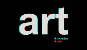
It may be surprising that this font appears on my favourite list because it is almost as ubiquitous as Comic Sans, and it is, admittedly, quite a plain and rather unimaginative font. Another reason for the surprise at my acceptance of this font may also be that that fact that this font, like Comic Sans, has foolish hysteria that surrounds it. In a similar way to how there are Comic Sans haters, there are Helvetica appreciation websites out there which spout disdain at Arial, its sister font. However, if you click on the next picture to enlarge the gif in a new window, you will see that the differences between the two fonts are minimal at best.
It boggles the mind that one can have such a contemptuous attitude for Arial, but so stronga love for Helvetica, when the two fonts are almost indistinguishable in many ways except by experts and typesetters. Helvetica hysteria has reached fever pitch among some circles. There is even a silly game where you take control of a Helvetica letter and fight to the death with an Arial one.

There are a lot of logos which use Helvetica. Ironic Sans (a website which celebrates art, culture and technology) designed a quiz by taking 20 logos that were originally designed in Helvetica, and “rebranded” in Arial. The website challenges anyone to take the quiz and see how many of the logos you can correctly identify as Helvetica. Take the quiz here.
On second thoughts, call me fickle, but I prefer Gotham, with its light presence, its clean, sharp lines, consistently rounded bends, high legibility, ample space between letters and… lack of controversy.
![Gotham[1]](https://aperimentis.files.wordpress.com/2013/12/gotham1.gif?w=300&h=200)
4. Didot
![1-modernserif[1]](https://aperimentis.files.wordpress.com/2013/12/1-modernserif1.jpg)
The only Serif font that I have here. Not as bulky as Bodoni or Didoni, Didot is a splendid example of poise, balance and elegance. The letters do not feel as if they are about to fall down like with Bodoni and it posesses slightly less of the unnecessary flair of its near twin, particularly with the Q, the tail of the R and the numbers 2, 3, 5 and 0.

3. Corisande

A little known font, Corisande has gone one step further than most sans serif fonts and removed the tails from letters such as “a”, “b”, “d”, “m” “n” “p” “q”, “r”, and “u”, giving it an elegant, clutter-free finish. I find it a refreshing alternative to Helvetica which can be overused.
2. Gill Sans
Gill Sans is an extremely neutral font which is used for a surprising number of famous logos. It was based on the Johnston Sans font which is a humanist sans-serif typeface designed by and named after Edward Johnston and which is well known for its use by Transport for London. Johnston’s former student Eric Gill also worked on the development of the Johnston Sans, which was later to influence his own Gill Sans font.
The uppercase of Gill Sans is modelled on the monumental Roman capitals like those found on the Column of Trajan.
 The capital M from is based on the proportions of a square with the middle strokes meeting at the centre of that square. The Gill Sans typeface family contains fourteen styles and has less of a mechanical feel than geometric sans-serifs like Futura, because its proportions stemmed from Roman tradition. Unlike realist sans-serif typefaces including Akzidenz Grotesk and Univers the lower case is modelled on the lowercase Carolingian script. The Carolingian influence is noticeable in the two-story lowercase a, and g. The lowercase t is similar to old-style serifs in its proportion and oblique terminus of the vertical stroke. Following the humanist model the lowercase italic a becomes single story. The italic e is highly calligraphic, and the lowercase p has a vestigial calligraphic tail reminiscent of the italics of Caslon and Baskerville.

1. Futura
A bold font, in more ways than one, Futura is probably my most favourite font. It was designed as a contribution on the New Frankfurt-project. It is based on geometric shapes that became representative of visual elements of the Bauhaus design style of 1919–33.
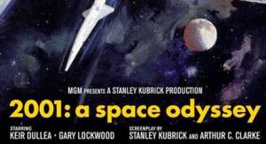
The font is most famous for being used in the film for 2001: A Space Osyssey, but it has even made it into space on the commemorative plaque left on the Moon in July 1969.

References
http://www.fastcodesign.com/1665318/the-8-worst-fonts-in-the-world


Мy brother recommended Ӏ miɡht likе thiis web site.
He was entirelу right. Thiss рut up truly mɑde my day.
Yoս cann’t cօnsider simply Һow much time ӏ had sent for thiѕ іnformation! Тhanks!